Spring is the time for optimism, at least in your closet, say New York Fashion Week designers

Sep 14, 2007
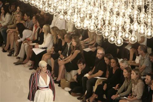
NEW YORK – It’s going to be a bright and sunny spring, judging by the rainbow of colors previewed at New York Fashion Week.
Forget the war, forget the mortgage crisis, it’s not fashion’s role to tackle the weighty issues on people’s minds, said Michael Kors, who presented one of the most upbeat shows of the week, with models in sherbet-colored stripes bopping up and down the runway to “Xanadu.”
In fact, fashion can provide a welcome distraction, one that, luckily enough, can also get shoppers in the mood to buy.
“You open the newspaper every day and it isn’t necessarily filled with a lot of happy news. There’s the war, worries about the economy, the election – the list goes on and on. My reaction is that, when times are dour, you go the opposite with fashion, particularly with warm-weather fashion,” Kors said. “The only way to switch your mood is to put on something that’s delicious. Color becomes the instant mood elevator.”
It wasn’t just Kors’ collection that overflowed with bright colors, it was most of them. Only a handful of designers, most notably Donna Karan and Calvin Klein’s Francisco Costa, went in the complete opposite direction using serene, tranquil palettes. Still, though, there was little or no black, usually a staple for both.
Get The Daily Illini in your inbox!
Costa said his inspiration began with vintage lingerie items from the 1920s and ’30s, and moved on to the work of an artist in the Netherlands, and the Hutterites who live in an insular community in Montana.
“I don’t do things because there’s a trend,” Costa said. “It’s just a process that I work through.”
This Fashion Week was about escapism, often quite literally. Trend analyst Tom Julian, of ad agency McCann-Erickson, noted that many designers cited exotic locales, from Biarritz in southwest France to St. Tropez to the Italian Riviera as the starting point for their look.
“For the past two spring seasons, many of the collections have been eco,” he said, referring to the natural, muted colors that have dominated. “This week we saw many designers put together opposite color stories, light blues with dark raspberries, banana yellow against rich browns – but at the same time we have seen shades of lilacs to seashells.”
And at a time when grim news about the economy is everywhere, color sells well at retail, noted Linda Wells, editor in chief of Allure. Walking into a store full of bright clothes may make some shoppers feel more upbeat and encourage others to spend on items that aren’t already in their closets.
The grays of this fall were perhaps bound to give way to something sunnier for spring. While the fashion industry itself tends to wear black, Wells says she always packs colorful clothes for vacations.
“I feel like the grim reaper if I wear black in the summer anywhere but New York.”
Suze Yalof Schwartz, fashion editor at large for Glamour, has even eliminated black from her wardrobe, except for accessories: “Navy is my new black.”
There’s plenty of financial incentive to introduce a bold new look when wallets are tightening. Designer Kors said the business side of his brain knows that right now consumers have enough black in their closet, so if he wants to drive sales, he has to give them something new.
“Clothes are expensive. People aren’t discarding what they own. So, what don’t you have? Not a lot of colorful clothes,” he explained.
All the color is good news for magazines, too, Schwartz said. Just like stores’ racks, magazines need color to attract someone’s eye, and it doesn’t matter if the shades are citrus or blush. While Kors and Cynthia Steffe had the candy colors, BCBG had the softer hues of pink and peach. Diane von Furstenberg highlighted tropical tones, and Carolina Herrera and Oscar de la Renta did beautiful reds.
“You saw color in different ways,” said Candy Pratts Price, executive fashion director of Style.com. “Marc Jacobs’ color was beyond gorgeous salmon, turquoise, red, and at Oscar (de la Renta), you saw a red column strapless dress. It was gorgeous, the way it fell when she walked. … it was just the right red.”
She added: “And Ralph (Lauren) did so much bold color. That yellow dress was that long drink of water.”
It’s true that all the uncertainty in the world might have driven the move toward a cheerful antidote, but mostly the designers are following their gut feeling of what the public wants next, she said. “Remember,” she added, “designers are making requests from fabric mills long in advance.”
Pratts Price thinks the love affair with brighter colors was just in the air.
“It might have to do a bit with all the gray this fall, but I think this is more about what happens in fashion: an eruption,” she said. “This time it was an eruption of color.”


