Love, likes and dislike of Nike’s rebranding efforts
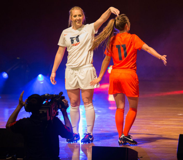
Brenton Tse The Daily Illini Illinois soccer players Hope D’Addario and Claire Wheatley model the new Fighting Illini soccer uniform during the Nike Brand Identity Launch at Krannert Center for the Performing Arts, on Wednesday, April 16, 2014.
Apr 17, 2014
Okay, so the Nike Rebrand reveal ceremony Wednesday night wasn’t really an epic unveiling.
Unless you live in a cave, you were able to see the new logos and most of the new uniforms for Illinois athletics on Tuesday night following an Internet leak. After spending an entire day marveling at Nike’s 18-month masterpiece, I’ve decided that so far, the Illinois Nike rebrand was largely a success.
First off, what we got is clearly an upgrade over what we had. We have consistency across all the sports. Gone are the different sized Block I’s, the varying fonts and the contrasting shades of orange.
As most expected, we kept the Block I as our primary logo, albeit a slightly refined one. We also added a new, secondary logo. (Victory Shield!) But consistency was probably the most needed aspect of this overhaul, and we got it. The uniforms will actually be, well, unified.
What I loved: I don’t think the football uniforms could have turned out any better. Nike managed to convey a modern yet traditional look without going over the top. The hidden stripes across the chest as a tribute to Red Grange are genius. The shield on the collar fits perfectly, and the matte helmets with the chrome accents are sharp. The all-white uniform is easily the best combination, and Donovonn Young looked like he descended from Illini football heaven when he took the stage in the white set.
Get The Daily Illini in your inbox!
Imagine that look when Illinois takes the field under the lights against Ohio State on November 1. We might not win the game, but we’ll win the fashion show.
I also am very fond of the soccer jerseys. The shield logo is reminiscent of the recent USA soccer logos, which were designed by — you guessed it — Nike. The shield definitely works best as a primary logo on a soccer kit, and I’d buy a jersey if it came in a men’s size. It’s a classy look.
What I liked: The basketball uniforms will be unique in the college basketball landscape. The zig-zag marks on the sides of the jersey might be a bit much, but they may be an unofficial homage to the Chief, so I’m on board with it. The orange uniform is bold and looks great. I really like the gray uniforms and the blue and white ones are good enough.
Basketball uniforms are tweaked every few years anyway, so what we see now may not be around for long. I also approve of the volleyball jerseys, which are hard to mess up from a design standpoint.
What I didn’t like: The absence of “Fighting Illini” on the basketball jerseys. It had been hinted online that this would be a big part of the rebrand, and that turned out to be misleading, at least at this point.
I also could have done without the endless clichés that Nike rep Todd Van Horn fed to the Krannert Center crowd during the presentation.
Finally, the baseball uniforms are seriously underwhelming.
The majority of fan response on social media has been positive. Ultimately, it’s the durability of the brand that matters. The uniforms can be changed relatively easily, but a brand should stand the test of time.
Alex is a sophomore in AHS. He can be reached at [email protected] and @aroux94.


