


Is there a typeface more widely scorned than Comic Sans?
Over the years, Comic Sans has become the font everyone loves to hate. If being the subject of memes and online ridicule by typeface purists wasn’t enough, the font also sparked a “Ban Comic Sans” movement, originally begun as a joke by two graphic designers who felt that using Comic Sans was “analogous to showing up for a black tie event in a clown costume.”
Comic Sans was created in 1995 by designer Vincent Connare, who worked for Microsoft’s typography team. He made the font for their program Microsoft Bob, which was intended for children and beginner users. Microsoft Bob consisted of a cartoon dog giving instructions to users, but Connare didn’t think the Times New Roman typeface would be a good fit for the talking dog’s speech bubbles.
“I had an idea to make a comic-style text and started looking at Watchmen and Dark Knight Returns, graphic novels where the hand lettering was like a typeface … I looked at various letters and tried to mimic them on screen,” Connare said in an interview with The Guardian.
Connare said he had fun “breaking the typography rules” to create the typeface. He didn’t use straight lines or make letter pairs like b/d or p/q mirror images of each other. In his own words, “It’s supposed to be wrong!”
Get The Daily Illini in your inbox!
Connare did not complete the typeface early enough to be included in Microsoft Bob, but it was eventually released in the Windows 95 Plus Pack. Ever since, its use — or rather, misuse — has been subjected to universal backlash and derision.
In 2012, a World War II memorial in the Netherlands was criticized for using Comic Sans on its memorial stone. In the same year, to the indignation of many, the European Organization for Nuclear Research used Comic Sans on its presentation slides for the discovery of the Higgs boson. The Sydney Morning Herald’s use of the typeface to commemorate its coming-of-age in 2014 — within speech bubbles, as originally intended by the creator — similarly backfired.
These reactions are not surprising. Comic Sans’ childlike, uneven lettering lends the font a ridiculousness that makes it look out of place anywhere besides children’s birthday cards. It certainly wouldn’t be anyone’s first pick to write a thesis or a newspaper article.
But what if I told you it could be? In the privacy of our Word documents, we’re spoiled for choice when selecting a font to write with. Comic Sans, despite its infamy, should be your new go-to typeface.
The common objection to the use of Comic Sans in more ceremonial settings is its ungainliness. Its wide letter spacing, absence of mirror-image letters, and casual appearance emulating comic book style text are all intentional. The irony is that the characteristics which make Comic Sans unsuitable as a formal font are exactly what make it great for writing.
Although I’ve been writing since I was six, the years following the pandemic left me staring at an empty Word document more often than not. I switched to writing my short stories by hand, which helped considerably and led me to explore typefaces similar to handwriting. In the past couple of years, I’ve let go of my bias against Comic Sans and started using it to write, and it has worked wonders.
The wonkiness of the letters makes the typeface far less daunting than Helvetica or Times New Roman. Due to its unpretentiousness, I feel less pressured to produce a perfect piece from the start.
I can give myself space to focus on getting my thoughts down and letting my words flow smoothly. After all, the most important part is producing a first draft. Editing the draft afterwards is far easier, and impossible to do if you never managed to write anything in the first place.
Comic Sans is now my preferred typeface for any sort of writing exercise, be it final papers, short fiction pieces, or even the columns I write for The Daily Illini — this one included. I’m not the only one this switch has helped: Other writers have reported that using this font has made writing far easier for them, too.
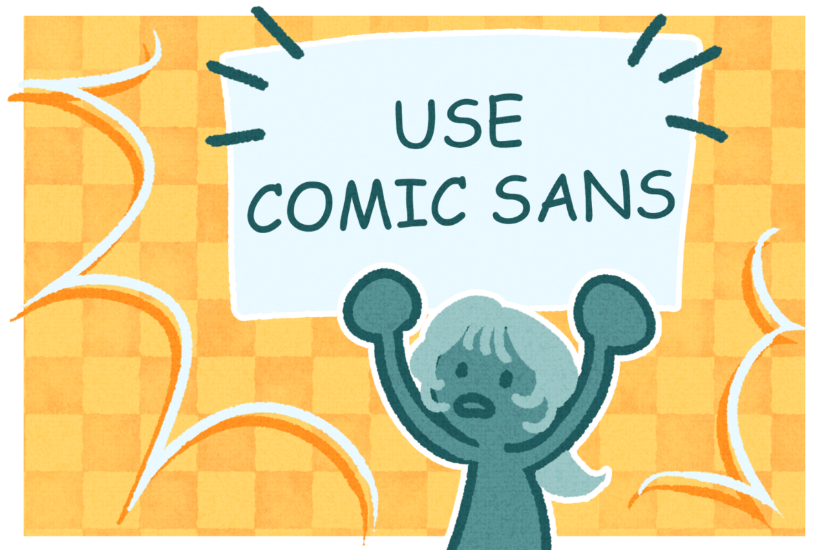
In recent years, the backlash against Comic Sans appears to be declining. The “Ban Comic Sans” movement resulted in an opposing movement in 2019 called “Use Comic Sans.” It seems the font can now finally be used without causing an uproar — which is a great victory for the typeface given its history.
So, next time you find yourself stuck in the middle of an essay with a deadline looming or procrastinating on a piece of writing because you have no idea where to start, try switching to Comic Sans. It may not be the prettiest or the most polished font, but its imperfectness might be just what you need to make your writing perfect.
Ayushi is a junior in Engineering.