Best Illini uniforms: Blue jerseys top 2019-2020 selections
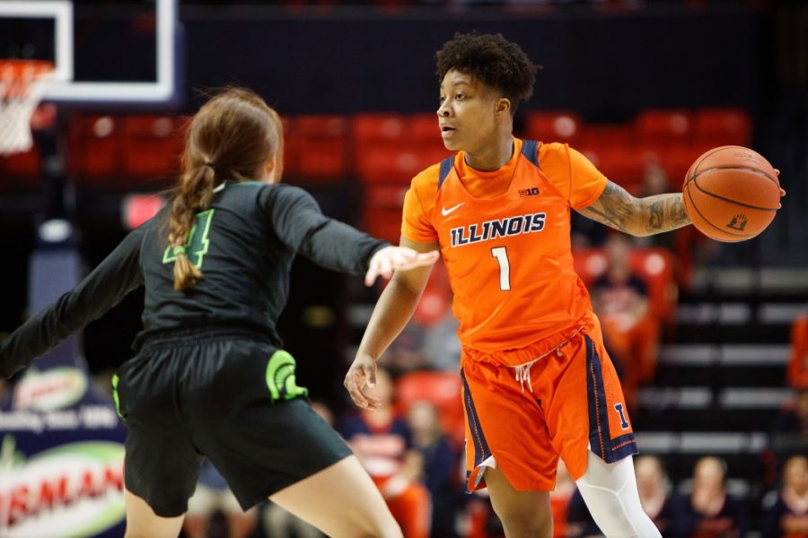
Guard Brandi Beasley dribbles the ball during the Illinois’ game against Michigan State at State Farm Center on Feb. 26.
May 7, 2020
Editors note: In a previous version of this article, the images shown were the women’s volleyball uniforms and not the women’s basketball uniforms. The Daily Illini regrets this error.
College teams often switch up jerseys. Sometimes, the teams get creative with designs, like Notre Dame’s lime green 2015 NCAA tournament jerseys. Other times, the teams keep it simple, which includes teams like Illinois. This year, the Illinois women’s basketball team wore five different jerseys, all sponsored by Nike, which I’ll profile here, from worst to first.
5. Gray: Gray is the drabbest color on the planet. Even the name sounds glum, and the aesthetic didn’t compliment the team. But despite the drabness, the team wore it a couple of times, including during its 74-71 win over Minnesota in January.
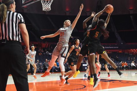
Nancy Panagiotopoulou Andritsopoulou of the Illinois Women’s Basketball team leaps to block a Maryland player at State Farm Center on Jan. 23, 2020.
4. Pink: Every year, Illinois, along with every other women’s basketball team in the country, wears a pink jersey in its Play4Kay game. It’s a tradition in honor of former North Carolina State coach Kay Yow, who died of breast cancer in 2009. Every athlete’s jersey features someone’s name who has been affected by breast cancer, and the team auctions off the jersey to raise money for the Mills Breast Cancer Institute at Carle Hospital. The team wore pink against Wisconsin and also wore pink when they won at Penn State in February.
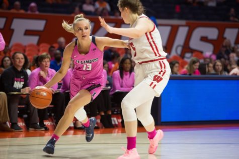
Guard Petra Holešínská pushes forward against a defender during the game against Wisconsin on Sunday. The Illini lost the match 73-64.
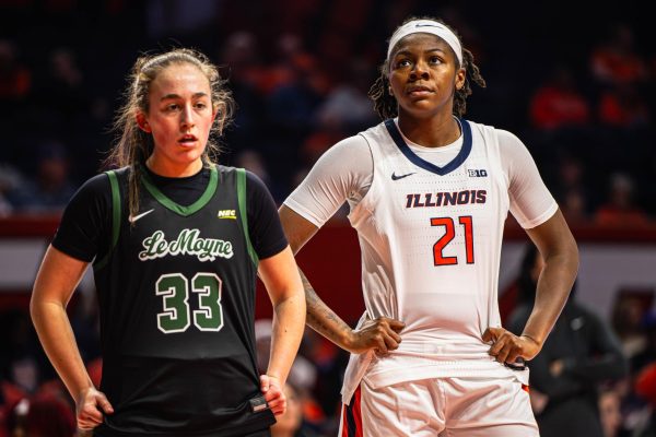
3. White: The classic basketball color, the team’s white uniforms were clean and modern. Historically, white has been the classic uniform for Illinois, with teams from the 1980s to now wearing white jerseys (some of the older fashions scream 1980s), but the aesthetic has taken on a shape in recent memory. The team has white jerseys with orange accents, a simple style the team has worn over the past several years. The team wore white in early season wins against Holy Cross and Evansville but also in Big Ten home games against Northwestern and Rutgers.
Get The Daily Illini in your inbox!
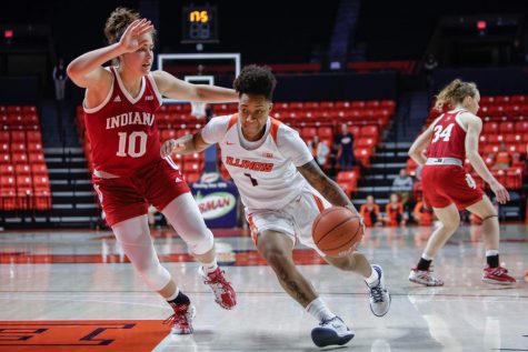
Senior guard Brandi Beasley drives past an Indiana player during the Illini’s game against the No. 20-ranked Hoosiers. Illinois fell to Purdue Sunday during Senior Day at the State Farm Center.
2. Orange: While I ordinarily think orange is one of those colors nobody looks good in, the team reps orange quite well. Orange can sometimes be a busy color, but the team makes it look stylish. Orange was worn more frequently in the early half of the season, and the team was wearing orange when it picked up wins against Merrimack and Presbyterian early in the season.
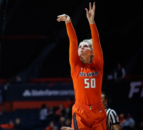
Senior forward Ali Andrews shoots the ball during the Illinois’ game against Michigan State at State Farm Center on Feb. 26.
1. Blue: Blue is by far the more aesthetic of the two school colors. Everyone looks good in blue, and it’s a less busy design than most of the other jerseys the team wore. Unfortunately, the blue was predominantly an away jersey, so Illini fans didn’t see much of the blue in-person. Despite that, the team won at rival Missouri in December while wearing the blue jerseys.
@claire_obrien43


