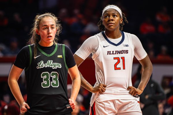
Best Illini uniforms: ‘Flyin’ Illini’ uniforms earn top spot in 2019-2020 rankings
May 9, 2020
Entering the 2019-2020 season, Illinois introduced three new modern uniforms to go along with their orange “Flyin’ Illini” themed uniforms that debuted during the 2018-2019 season.
The new modern uniforms feature a thick three-pattern stripe on all three uniform sets. The home whites and alternate orange uniforms spell out “Illinois” across the chest, while the road blue uniforms have a two-leveled “Fighting Illini” across the front.
In December, the Illini surprised fans with a second white uniform as a throwback to the 1970s, which features Illinois in a navy-blue script across the chest. Let the rankings begin.
- Navy Blue Road Uniforms: These are easily the worst uniforms Illinois sported in 2019-2020. There is no problem in having a two-leveled “Fighting Illini” across the front of the jersey, but it looks forced with Illinois’ new font. The orange and navy blue stripe down the sides of the jersey and shorts is a better look than the black and orange stripes we have seen in the past, but it isn’t enough to overcome the awkward “Fighting Illini” on the jerseys.
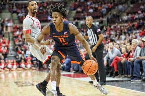
Sophomore Guard Ayo Dosunmu speeds around a defender during the match at Ohio State on March 5.
Get The Daily Illini in your inbox!
- Modern Home White Uniforms: Illinois broadcasted the new white uniforms across their social media before the start of the 2019-2020 season, and there were some mixed reviews. In the last 20 years, it has been common for Illinois’ white uniforms to feature blue lettering and orange numbers, but the new uniforms keep a consistent look with orange lettering and numbers. These uniforms aren’t horrible, but they could be improved. Anything is better than the zigzag Illini fans were forced to watch from 2014-2017.
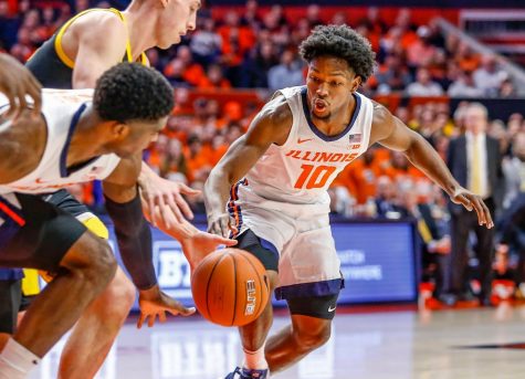
Senior Guard Andres Feliz reaches for a loose ball during the match against Iowa on March 8.
- Modern Home Orange Uniforms: Illinois didn’t showcase the new orange uniforms across Twitter like they did the new white kits, but they probably should have. Similar to the white uniforms, the orange set has matching white lettering and numbering on the front and back. Since 2000, Illinois’ orange uniforms have been seen with navy blue lettering, which sets off the orange jersey with white numbers. I wouldn’t mind seeing the Illini switch back to the navy blue lettering on the orange jerseys; it looks better than the white.
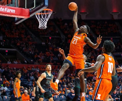
Freshman Center Kofi Cockburn dunks the ball during the match against Hawaii on Nov. 18, 2019.
- Throwback White 1970s Script: This is when the rankings get really difficult, so if you have these as number one, I wouldn’t argue too much. The script “Illinois” across the chest is a great look, but the best part about these uniforms is the shorts. The navy “Block I” inside of a navy-orange-navy diamond stripe is a classic look, and it gives a bold logo identity that modern uniforms don’t capture. Illini fans loved these uniforms and they should stay in the rotation for a long time because they are great.
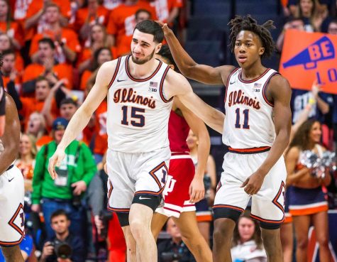
Sophomores Ayo Dosunmu and Giorgi Bezhanishvili encourage each other during the match against Indiana on March 1.
- Throwback Orange “Flyin’ Illini”: I have the “Flyin’ Illini” uniforms as the best set for Illinois for a couple of reasons. One, the two-leveled “Fighting Illini” across the front looks great in classic block white lettering. Similar to the white script uniforms, the “Flyin’ Illini” uniforms feature a perfectly sized navy blue “Block I” that shows the Illini’s identity. What really pushes these uniforms to the number one spot is that Illinois has a great history wearing this uniform, going to the Final Four. Uniforms are best remembered when the teams win a lot of games in them, and Illinois won many games in the “Flyin’ Illini” kits.
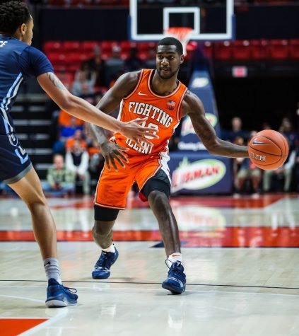
Junior Guard Da’Monte Williams passes the ball during the match against Old Dominion on Dec. 14, 2019.
Recently, scrolling through the Illini Twitter universe, I have come across fans asking for Illinois to break out the 2004-2005 throwback uniforms. The 2004-2005 uniforms are great because they are clean and don’t feature any crazy designs, like a massive zig-zag down the sides. If Illinois uses more new uniforms in 2020-2021, I might have to update this list, especially if they offer any resemblance to the uniforms the best team in Illinois history wore. The Illini have good uniforms, and they do a good job of wearing the uniforms they know the fans like. Keep that up, Illinois.
@Alec_busse


