


The best and worst of the Illini Nike rebrand so far

Jul 5, 2015
It has been over a year since the Illinois athletic department unveiled its new rebranded look, courtesy of Nike. Almost all of the sports teams have seen the new logos and word marks filter into their apparel in some way, shape, or form, and several of them have received entirely new uniform sets.
It always takes time for new branding to really take hold, whether it be for a corporation or your favorite sports team. The various old logos will never completely go away, but eventually they won’t be seen on any Illini teams’ uniforms, as the budget allows for complete uniform replacements.
With a full year of Illinois sports in the books, I thought it would be fun to take a look back at the best and worst of the Nike rebrand. Full disclosure: I am by no means a fashion expert (I wore socks and flip-flops out in public today). But even though my opinions on the subject carry zero weight, I’m going to offer them anyway.
The Best:
I don’t think Nike did its absolute best work with the Illinois project, but the corporation definitely produced some really great-looking uniforms for a handful of Illini teams. If I’m picking a favorite, the football, track, and softball uniforms come in a three-way tie for first place as the beneficiaries of a job well-done by the Swoosh.
Get The Daily Illini in your inbox!
Obviously, the football program has a lot more eyes on it than the nonrevenue sports, so it was important that Nike produce a look that fans could be proud of. The new jerseys on the gridiron aren’t flashy, but the uniforms have several subtle nuances from the helmets on down that result in a classic look that can last. The “victory shield” fits perfectly on the collar, and the vertical stitching pattern on the chest is a nod to the jerseys Red Grange wore for the Illini in the 1920s. The all-white look is fantastic, and the only flaw was not having the blue jerseys ready in time for last season. I can’t wait to see the complete set in 2015.
If you didn’t get a chance to catch a track or cross-country meet or a softball game this past year, you likely didn’t see some truly awesome gear adorned by Illini athletes. The track and cross-country teams featured tank-tops in competition that were a nod to teams of the past; a rebranded Block I on the chest over an orange sash pattern gave the Illini runners an Olympic look. Over at Eichelberger field, the softball team had the privilege of wearing an absolutely fantastic set of unis. They’re crisp, clean and showcase the best use of the rather uninspiring new Illini font.
The Worst:
For every swaggy new style Nike blessed the Illini with, there were some head-scratchers as well. The new baseball uniforms are pretty terrible, and quite frankly don’t look too comfortable to play in. The font is too small, the jerseys themselves are way too baggy, and the numbers are curiously displayed on the left side instead of the front of the jersey instead of the right. The baseball team was obviously amazing this past year; let’s get some better uniforms in the dugout.
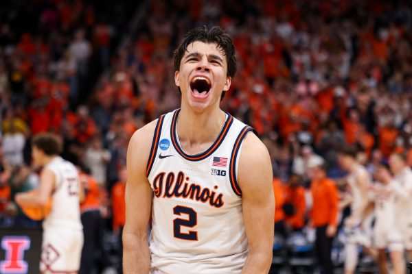
Nike did an okay job with the basketball uniforms overall (I love the white throwbacks), but the new white sets really missed whatever mark they were trying to hit. The “Illinois” word mark is two-toned in orange and blue, and I just don’t think this is a good look no matter where it shows up. The brash, zubaz-esque zig-zags streaking down the sides of the uniforms are an attempt to create something unique, but just appeared tackier with each passing game. We’ll see how long they stick around.
Wait and See:
Nike also surprised us with the new victory shield, and I’m reserving judgment on this particular logo until I see how it’s implemented more widely going forward. It’s a cool secondary mark that looks especially great on golf shirts and car magnets, but I’m not sold on it turning into a logo that ever becomes beloved or revered.
Undoubtedly, the victory shield’s finest hour was when it was Photoshopped onto a picture of football coach Tim Beckman leading his team out of the tunnel into battle.
Alex is a senior in AHS.