Best Illini uniforms: Blue-gray threads highlight Illinois baseball’s 2020 combinations
May 12, 2020
Illinois sports teams all typically have clean, simple uniforms. The Illini baseball team has followed that style with very standard uniforms consisting of orange, blue, white and gray colors. The Illini have five consistent shirts they rotate and three different pants.
Like every team at Illinois, the baseball uniforms are sponsored by Nike and feature the brand’s logo on one side of the chest, with the Big Ten logo on the opposite side. Each shirt has “Illinois” written across the chest in either blue, orange or white script. When taking the field, the Illini typically wear a blue baseball hat with an orange bill and orange Block I. Head coach Dan Hartleb requires his players to wear their pants down at the ankle so their socks are never fully shown.
Here, I rank seven of the most utilized uniform combinations for the Illini baseball team from my least liked to most liked.
- Orange shirt; Pinstripe pants: There is way too much going on in this combination. First, I’m not really a fan of the orange jersey across most of the Illinois sports. It’s very bright and takes away from a lot of the uniform’s other elements. Then, to pair the most flashy shirt with the only non-solid colored pants is a lot to look at. Adding the blue hats into the mix … that’s a no for me.
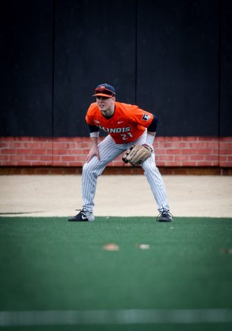
Freshman Outfielder Danny Doligale sits in wait during the match against Wake Forest on Feb. 16.
- Standard Road Grays: There’s not much to discuss here, as gray is not a great color to begin with. It is very difficult to make a grout-fit look good or stylish. If paired with different colored pants, the gray shirt would look better as the gray pants look way better with orange and blue shirts.
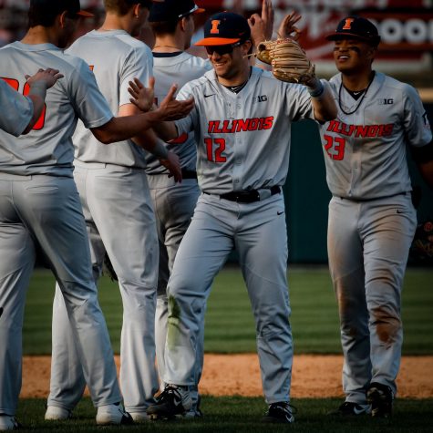
The Illinois baseball team celebrates a road win against Oklahoma State on Feb. 29.
Get The Daily Illini in your inbox!
- Orange shirt; Gray pants: As I mentioned before, I’m just not a big fan of the orange shirt. While it definitely looks better with the solid gray pants, it will never rank in the top half for me.
- Primary White Cutoffs: I am a huge fan of the all-white uniform across all sports. For baseball, I love the blue lettering with an orange outline against the white. The combination makes for a clean look. The only thing that throws me off about this uniform is the sleeveless aspect. I understand it, and I appreciate the switch up from other uniforms, but it’s usually cold in Illinois during baseball season, which kind of makes them unnecessary.
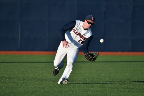
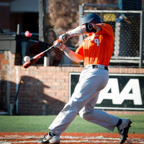
Redshirt Junior Outfielder Andrew Dyke fields a ball during the match against Chicago State on March 3.
- Honor and Serve (2019): Every season the Illini play an Honor and Serve game where the team debuts a new, special uniform. Because of the 2020 season being cut short, I ranked the 2019 Honor and Serve uniform. I liked the 2019 Honor and Serve uniforms a lot. I know I was previously hating on gray, but the dark gray with the dark blue sleeves creates a really sleek look and is contrasted well by the white pants and blue hat.
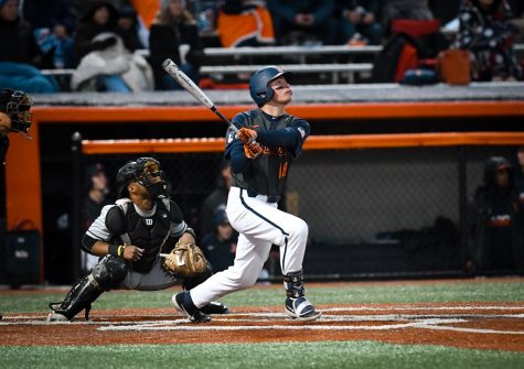
Redshirt Sophomore First Baseman Kellen Sarver watches and begins to run as the ball soars through the air during the match against Purdue on May 11, 2019.
- White Pins: The pinstripe uniforms are just a baseball staple. This look has been a classic for decades across all levels of baseball, especially the MLB. I think splitting up the pinstripes with different shirts or pants takes away from the aesthetic effect of the uniforms. But pairing them together gives off a really nice and nostalgic look.
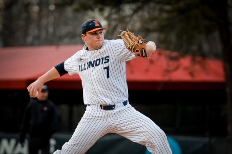
Senior Pitcher Ty Weber winds up for a pitch during the match against Elon on March 6.
- Blue Shirt; Gray Pants: Nothing compares to the navy blue shirt. The blue color makes the white lettering and the bright orange pop but not in an obnoxious way. The gray, or sometimes white pants when they wear them, perfectly contrasts with the dark shirt coloring. I think this combination just pulls all of the Illini’s main colors together in the best way.
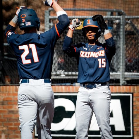
Junior Taylor Jackson and Freshman Danny Doligale celebrate during the match against Elon on March 8.
@gabby_h11


